
A while ago I built my portfolio and I wrote a custom audio player to showcase my tracks. Since then quite a few people have been interested in its technical implementation. I've always replied I might write a full-length tutorial for it, yet the strict deadline for it was never set.
In April 2022, I saw a Writeathon being announced by Hashnode and one of the entrance categories being Web applications. I knew this was a perfect opportunity to enter and finally get the job done. I'm glad I stumbled upon it since it really motivated me.
This article would be beneficial not only for the practical end result you will get but also for educational purposes for people that are looking to switch careers to app development or explore the React ecosystem, due to the following couple of reasons:
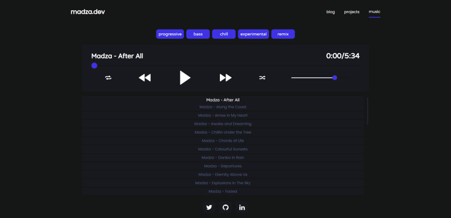
Here is the deployed preview and use of the music player on my portfolio to get you an insight into what we will be building in this tutorial:
The source code of the audio player is open-source. I have also made an NPM package out of it so you can easily set it up in your existing projects, as well.
The most basic audio players usually come with a minimal set of features like a play/pause button, volume, or progress controls, which might be a good solution if you want to play a single track and do not have to match the player to the design of the site.
Though, if you care for some extra functionality and the experience of your end-users, chances are you will want some advanced solution.
In this tutorial, we will be focusing on a more complex case where you have multiple tracks to showcase, need to implement a way to quickly find or filter them, and want to control the behavior of the play order. The full list of features we will implement include:
The audio player will use a straightforward user interface with different functionalities divided into separate components. This will make the audio player intuitive and improve the overall user experience when interacting with it.
The whole wireframe of the app will look like this:
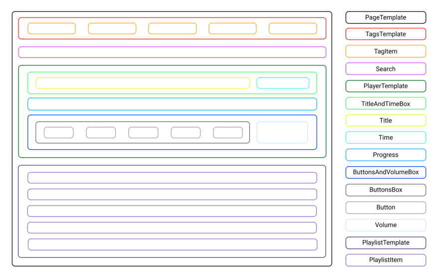
We will use Template components as the main containers for the children. If the children include other elements themselves, they will be wrapped in Box components.
The whole app will be wrapped into the PageTemplate wrapper, which will include the children components: TagsTemplate, Search, PlayerTemplate, and PlaylistTemplate.
TagsTemplate will further include the children TagItem, PlayerTemplate will include TitleAndTimeBox, Progress and ButtonsAndVolumeBox, while the PlaylistTemplate will include PlaylistItem component.
Even further the TitleAndTimeBox component will include Title and Time components, while ButtonsAndVolumeBox will include ButtonsBox and Volume components.
Finally, ButtonsBox will include all the Button components for user controls.
The design of the audio player will be based on maximum accessibility so that all of the information is easy to read and all action buttons are easy to distinguish from the background panels of the player.
To achieve that the following color scheme will be used:
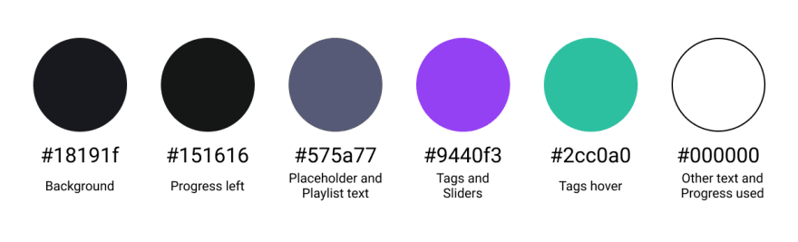
The tags will have a purple background color to give them an accent to the main color scheme used in the rest of the audio player. This will give a great notice to the user about the included genres of the tracks. To further improve the user experience they will change the background color to green on the hover event.
The search will have a dark background, with the grey placeholder text displayed on it. The placeholder text color will be less accented from the rest of the text purposely, in order to notify the user that the input value is expected. Once typed in the input text will be displayed in white.
The player itself will have a dark background color and all the included text for the track, title and time will be white to give maximum contrast. Further, all the icons in the player will be in white as well, so they stand out from the dark background.
For the progress bar and volume slider, the used progress will be in white, while the left progress will be in a darker shade. The slider knobs will use the same background color as the tags, so the user is notified that they can interact with them.
Finally, all the playlist items will have a dark background as well. To give the accent to the currently played track, it will have a white color while the rest of the inactive tracks in the playlist will have the same color as the search placeholder.
